Mastering Design Concepts Interior Design A Practical Guide
Have you ever walked into a room and just felt... right? That feeling of instant calm and harmony isn't an accident. It's the work of well-executed design concepts in interior design. Think of these concepts as the secret language of a beautiful space. They’re the underlying principles and elements that guide every decision, from where the sofa goes to the exact shade of white on the walls.
Learning this language is what separates a pretty room from a truly well-designed one. It moves you past just picking things you like and into a more intentional, repeatable discipline.
The Hidden Language of Beautiful Rooms
When a space feels effortless, it’s because a designer has skillfully woven together these foundational rules to create a cohesive experience. This guide is all about demystifying that process. We're going to pull back the curtain and look at the what and the why behind interiors that just work. Instead of seeing design as some elusive art form, you’ll start seeing it as a practical framework for creating rooms that are not only stunning but also functional and emotionally resonant.
Our journey starts with the grammar of design. By breaking down the core concepts, you'll gain the confidence to analyze, plan, and execute projects with real purpose. This knowledge is your key to unlocking consistently successful results, whether you're designing for a client or for your own home.
Why Mastering Design Concepts Matters
Getting a handle on design theory is more than just an academic exercise—it’s a serious professional advantage. People are more aware than ever of how their environment affects their well-being and productivity, and the demand for thoughtfully designed spaces is booming. This has kicked off a period of major industry growth, creating incredible opportunities for designers who can deliver polished, concept-driven results.
The global interior design market was valued at around $138 billion and is expected to hit $208 billion by 2033. This growth is being powered by increasing urbanization and a widespread desire for living and working spaces that are both beautiful and highly functional.
Of course, a bigger market means more competition. For solo designers and small studios, being able to visualize and present sophisticated ideas quickly is a game-changer. Thankfully, new tools are leveling the playing field. For instance, AI-powered platforms like MoldaSpace allow designers to generate photorealistic renders from simple sketches in mere seconds. This kind of speed, which once required big-firm resources, makes it possible to iterate fast and turn abstract concepts into compelling visuals that win over clients. You can learn more about the interior design market forecast and its key drivers.
Ultimately, a solid grasp of these foundational concepts empowers you to:
- Create Cohesion: Make sure every piece in the puzzle works together to tell a single, unified story.
- Solve Problems: Use proven strategies to fix functional issues like awkward layouts or poor traffic flow.
- Communicate Effectively: Articulate the "why" behind your design choices to clients, building trust and getting them excited about the vision.
- Innovate Confidently: Once you know the rules inside and out, you know exactly how—and when—to break them with intention.
The Seven Principles That Guide Great Design
Think of a room you love. What makes it work? It's not just the stuff in it; it's how everything comes together. If the design elements (color, light, texture) are your ingredients, then the design principles are the recipe. They are the foundational rules that help us arrange those ingredients into something that feels right—something intentional and cohesive.
Mastering these seven principles is what separates a room full of nice things from a truly well-designed space. It's the secret sauce.
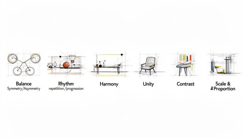
Let's break down this essential framework. Understanding how to apply these principles is how you move from just filling a space to actually crafting an environment with purpose.
Before we dive deep, here's a quick overview of what these core principles are and what they're designed to achieve. Think of this as your cheat sheet for creating a solid foundation in any project.
Core Interior Design Principles at a Glance
| Principle | Definition | Goal in Design |
|---|---|---|
| Balance | The distribution of visual weight in a room. | To create a sense of stability and equilibrium. |
| Rhythm | The visual path that guides the eye through a space. | To create movement, flow, and prevent stagnation. |
| Harmony | The sense that individual elements belong together. | To ensure pieces share a common thread (style, color, shape). |
| Unity | The overall feeling that the entire space works as a whole. | To create a cohesive, complete, and intentional environment. |
| Emphasis | The creation of a focal point or center of interest. | To draw attention and give the eye a place to land. |
| Contrast | Placing opposite elements together to create visual interest. | To add energy, depth, and highlight focal points. |
| Scale & Proportion | The relationship between the sizes of objects and the space. | To ensure every piece feels appropriately sized and placed. |
This table gives you the 'what' and 'why' at a high level. Now, let's explore the 'how' for each one.
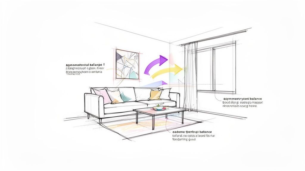
Achieving Visual Balance
Balance is all about visual equilibrium. It's what makes a room feel grounded and stable instead of chaotic or lopsided. You can feel when a room is out of balance—it’s just plain unsettling. There are three classic ways to get it right in your design concepts interior design projects:
- Symmetrical Balance: This is the formal, mirror-image approach. If you drew a line down the middle of the room, both sides would match. Think of a fireplace with an identical armchair and lamp on either side. It's traditional and creates a feeling of calm order.
- Asymmetrical Balance: Far more common in modern design, this is about achieving balance with different objects that have similar visual weight. A big sofa on one side can be balanced by two smaller chairs and a floor lamp on the other. It feels more dynamic and less rigid, but just as stable.
- Radial Balance: This is where everything is arranged around a central point, like spokes on a wheel. A round dining table with chairs circling it is the perfect example. Radial balance is fantastic for creating an instant focal point in an entryway or dining area.
Creating Rhythm and Flow
Rhythm is the visual beat of a room. It’s what keeps your eye moving, guiding you from one spot to the next in a smooth, natural way. Without rhythm, a room can feel static and disjointed. You create this sense of movement through strategic repetition.
Here’s how you can establish a visual rhythm:
- Repetition: Simply using the same element—a color, a pattern, a shape—more than once. The circular motif from a mirror might be repeated in the pattern of a rug and the shape of a pendant light.
- Progression: This is about taking an element and showing it in increasing or decreasing sizes. A set of nesting tables or a cluster of candles arranged from tallest to shortest are classic examples of progression.
- Transition: This is a more subtle way to lead the eye, often with a continuous line. A gracefully curved sofa or an archway can create a seamless transition, pulling you through the space.
Fostering Harmony and Unity
People often use these two terms interchangeably, but they play slightly different roles. Harmony is the feeling you get when all the individual items in a room seem to belong together. It happens when different pieces share a common trait, like a specific style, a color palette, or a material.
Unity is the grand prize. It’s the result of achieving harmony—the overall sense that the entire room works together as a single, powerful idea. When a room has unity, nothing feels like it was added by mistake.
A room can be full of harmonious Mid-Century Modern furniture but still lack unity if the layout is awkward or the scale is all wrong. Success is when harmony builds into a powerful sense of unity.
Using Emphasis and Contrast
Every great room needs a star of the show. Emphasis is about creating that focal point—the one thing that grabs your attention the moment you walk in. It could be a dramatic fireplace, a stunning piece of art, or a breathtaking view from a window. A room without a clear point of emphasis feels unfocused and, frankly, a bit boring.
Contrast is emphasis’s best friend. It’s the trick of putting opposites together to create a little drama and pull the eye toward that focal point. High contrast—like a dark sculpture against a pale wall, or a sleek, glossy table next to a nubby, textured rug—is what gives a space depth and keeps it from feeling one-note.
Mastering Scale and Proportion
We’ve saved the most important for last. Getting scale and proportion right is everything. If these are off, nothing else you do will matter.
Scale is about how the size of one object relates to another. For instance, is the coffee table the right scale for the sofa?
Proportion is about how the size of an object—or a grouping of objects—relates to the space it’s in. That huge, overstuffed sectional might be in perfect scale with a large coffee table, but its proportion would be completely wrong for a tiny studio apartment.
Getting these two right is non-negotiable. It’s the architectural skeleton of your design. A common rookie mistake is to fill a large room with dinky furniture, which makes the space feel cavernous and sad. On the flip side, cramming oversized pieces into a small room just makes it feel cramped and claustrophobic.
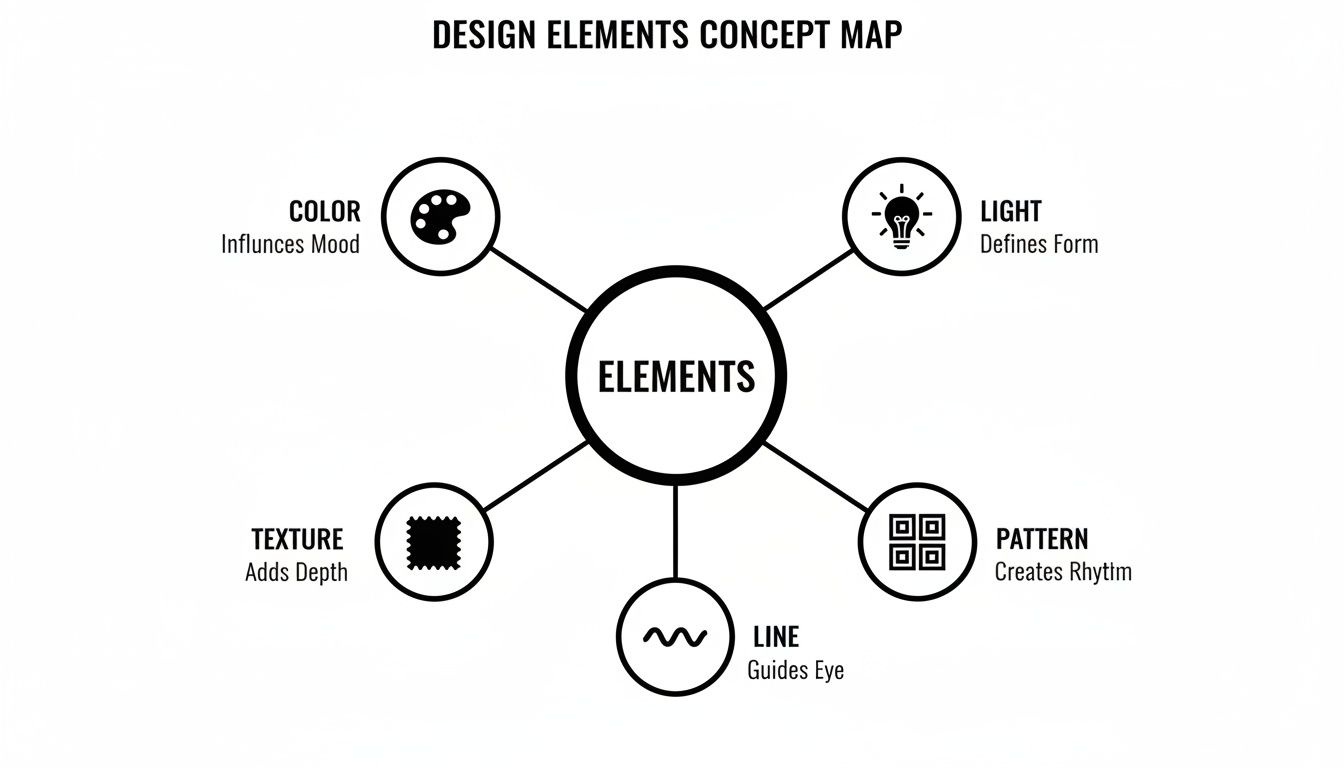
The Five Elements You Build With
If design principles are the "why," the elements are the "what." They are the tangible, sensory building blocks we use to bring a space to life. Mastering these five core components—Color, Light, Texture, Pattern, and Line—is where a designer’s vision starts to become a physical reality.
Think of it like being a chef. The principles are your recipe (balance the flavors, create a stunning presentation), but the elements are your actual ingredients—the salt, the herbs, the produce. How you select and combine them is what makes the final dish sing. Let’s open up the toolkit.
Color and Light: The Atmosphere Shapers
Color is, without a doubt, the most emotionally charged element in our arsenal. It’s so much more than paint on a wall; it’s a mood-setter and a perception-shifter. A deep, inky blue can wrap a room in a sense of calm intimacy, while a splash of vibrant yellow can make it feel instantly energetic and optimistic.
But color is nothing without its inseparable partner: light. The way light hits a surface can completely transform its character. A single paint swatch will look worlds apart in the cool, crisp light of morning versus the warm, soft glow of an evening lamp. Getting this dynamic duo right is absolutely non-negotiable for a successful design.
In any given room, you'll be working with three main types of lighting:
- Ambient Lighting: This is your foundation—the general, overall illumination that lets you move through the space safely and comfortably. Think of your main ceiling fixtures or recessed pot lights.
- Task Lighting: This is focused, purposeful light designed for specific activities. It’s the lamp you read by, the under-cabinet lights for chopping vegetables, or the vanity lighting for getting ready in the morning.
- Accent Lighting: This is where the drama happens. Accent lighting is all about creating focus and highlighting what you want people to notice, whether it’s a beautiful piece of art, a unique architectural detail, or a richly textured wall.
Texture and Pattern: The Layers of Interest
While color and light set the overarching mood, texture is what gives a room its soul. It's the tactile quality of a surface—how it actually feels, or how you imagine it would feel just by looking at it. A space filled only with smooth, flat surfaces can feel cold and one-dimensional, no matter how lovely the colors are.
Texture adds a crucial sensory layer. It’s the satisfying contrast between a rough, jute rug underfoot and a buttery-soft leather sofa, or a nubby wool throw draped over a sleek glass coffee table. This is what makes a space feel grounded, inviting, and real.
Pattern works hand-in-hand with texture to inject personality and guide the eye. It’s simply the planned repetition of a graphic motif. From the subtle herringbone of a wood floor to the bold, leafy print of a statement wallpaper, patterns create rhythm and break up visual monotony.
A great design often comes down to balancing these two. Too much competing pattern can feel chaotic and overwhelming, while a total lack of texture can leave a room feeling flat. The most compelling interiors find that perfect sweet spot, using texture to add warmth and pattern to add a carefully measured dose of character.
Line: The Director of the Eye
The last element, line, is often the most subtle but is arguably the most fundamental. Lines are literally everywhere you look: the clean edges of a sofa, the frame of a window, the grain in a piece of wood, and the very architecture of the room itself. They are the invisible pathways that guide our eyes and define a space’s form.
We can use lines strategically to completely change how a room feels:
- Vertical Lines: Think of tall bookshelves, floor-to-ceiling drapery, or thin vertical stripes. They draw the eye upward, creating a sense of height, aspiration, and formality.
- Horizontal Lines: You’ll find these in long, low-slung media consoles, wide sofas, and coffee tables. They ground the space, creating a feeling of stability, calm, and expansiveness.
- Dynamic Lines: These are your diagonals and curves. A sloped ceiling, a graceful arched doorway, or a funky zigzag pattern on a rug can bring a ton of energy, movement, and organic flow into a room.
These five elements are the true language of design. As you gain experience, you’ll learn to combine them with more and more nuance. And today, that language is evolving. For instance, sustainability is now a key factor, with eco-friendly material choices now driving nearly 60% of consumer preferences. Meanwhile, smart home integrations are surging by 25% year-over-year, changing how we think about elements like light and line. You can explore more data on how technology is reshaping the design industry. By understanding the unique power of each element, you can start building spaces that aren't just beautiful, but are also deeply functional and emotionally resonant.
How Design Styles Put Concepts Into Practice
The principles and elements we’ve discussed aren't just abstract theory—they're the DNA of every interior design style you've ever seen. Think of a style like Scandinavian or Industrial as a unique recipe. Each one uses the same basic ingredients (color, light, texture, balance, rhythm), but it's the way they're combined that creates a specific feeling and experience.
Once you grasp this connection, you can move beyond just copying a look from a magazine. When you understand why a certain style works—how it intentionally uses these core concepts—you gain the freedom to adapt, mix, and create spaces that are both authentic and beautifully cohesive.
Let's break down how a few popular styles put these ideas into practice.
Scandinavian Simplicity and Asymmetrical Balance
There's a reason Scandinavian design is so beloved; its cozy, uncluttered, and light-filled rooms just feel good to be in. At its heart, this style is a masterclass in asymmetrical balance. Instead of a perfectly mirrored layout, you’ll find a large sofa on one side of a room offset by two smaller chairs and a floor lamp on the other. It feels balanced, but in a relaxed, informal way.
The signature color palette is intentionally muted, leaning heavily on whites, grays, and soft blues. This is a practical choice designed to maximize natural light—a precious resource in Nordic countries. Without much color, texture becomes the star player, adding warmth and preventing the space from feeling cold or sterile. You'll see this everywhere:
- Cozy textiles like chunky wool throws and soft sheepskin rugs.
- Light-toned woods, especially birch, ash, and pine.
- Simple, clean lines in furniture that always puts function first.
This is a great visual of the five core design elements that styles like Scandinavian manipulate to create their signature look.
As you can see, every style is simply an intentional mix of these five building blocks, all working together to achieve a specific aesthetic and function.
Industrial Rawness and High Contrast
Industrial design, which grew out of converting old warehouses and factories into homes, is all about celebrating raw, structural beauty. Emphasis is created by exposing what other styles work so hard to hide: brick walls, steel beams, and concrete floors become the focal points. This style leans heavily on high contrast to create drama.
The soul of Industrial design is the honest expression of materials. It finds beauty in imperfection and utility, using the tension between rough textures and smooth, finished surfaces to build a dynamic, energetic environment.
You see this principle at play when a sleek, modern kitchen is set against a weathered brick wall, or when a smooth leather sofa sits on a rough concrete floor. Lighting is often stripped back and functional, with exposed bulbs and visible conduit becoming part of the aesthetic. The color palette is typically neutral and moody—think grays, blacks, and browns—which allows the rich textures of the materials to really command attention. For designers presenting such distinct concepts, understanding what is virtual staging can be a game-changer, helping clients visualize the full potential of a raw space.
Japandi and Harmonious Minimalism
Japandi is a hybrid style that beautifully merges the rustic simplicity of Japanese design with the cozy functionality of Scandinavian interiors. Its main goal is to create a deep sense of harmony and tranquility. This is achieved through a profound respect for natural materials, craftsmanship, and the principle of minimalism—keeping only what is essential, useful, or deeply meaningful.
The style uses a rich, earthy color palette that feels warmer than pure Scandinavian, incorporating shades of beige, cream, oatmeal, and charcoal. The application of design elements is subtle but powerful:
- Low-profile furniture that grounds the room and fosters a connection to the earth.
- An abundance of natural textures like bamboo, rattan, paper, and light-toned woods.
- A focus on craftsmanship and the Japanese concept of wabi-sabi, which finds beauty in imperfect, handmade objects.
Balance is crucial here, but it’s a quiet, asymmetrical balance. Rhythm emerges from the subtle repetition of natural textures and clean lines, guiding your eye gently through a serene and uncluttered space. Once you start seeing these "recipes," you'll realize that every great design style is simply a thoughtful, intentional application of these universal concepts.
Bringing Your Design Concepts to Life
Knowing the principles and elements is one thing, but translating them into a vision a client can see and feel? That's the real magic. This is where theory hits the pavement. A solid, step-by-step workflow does more than just keep you organized—it builds a story that gets your client excited and confident in your direction. It’s how you turn those abstract design concepts interior design into a concrete plan.
This process is all about bridging the gap between a client’s initial gut feeling and the finished, livable space. Each phase adds another layer of detail, refining the idea until it’s a complete blueprint for a beautiful, functional room.
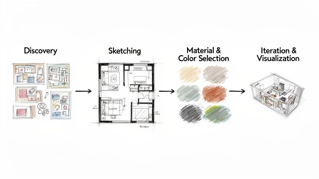
Let's walk through the four key phases that take a spark of an idea and turn it into a compelling proposal that wins projects.
Phase 1: Concept Development and Discovery
Everything starts with listening. This first phase is about absorbing your client's needs, wants, and lifestyle, then distilling it all into a cohesive visual story. Your best friend here is the mood board.
A great mood board isn’t just a collage of pretty pictures; it captures the feeling of the space. It sets the tone, establishing the core color palette, key textures, and lighting style that will anchor every single decision you make from this point forward.
Phase 2: Sketching and Space Planning
Once you’ve nailed down the concept, it’s time to get practical with the layout. This is where the principles of scale and proportion really get put to the test. A quick sketch or a simple digital floor plan is all you need to start playing with furniture placement and mapping out how people will move through the room.
This step is less about perfection and more about problem-solving. It’s your chance to confirm that the space will function just as beautifully as it looks, ensuring the layout feels natural and comfortable long before a single piece of furniture is ordered.
Phase 3: Material and Color Selection
Now for the fun part: layering in all the sensory details. This is when you pick the specific materials, finishes, and colors that bring your mood board to life. You’re selecting the exact flooring, the right wall treatments, the perfect fabrics.
Every choice you make is a direct application of the design elements. That dark, textured wood adds a pop of contrast; a soft velvet fabric introduces warmth and a touch of luxury. This is where abstract ideas become tangible, real-world selections.
Phase 4: Iteration and Visualization
The final, and arguably most important, step is pulling everything together into a photorealistic visualization. Modern technology has completely changed the game for designers here. In a market where 80% of revenue comes from residential and commercial clients, showing a crystal-clear vision is non-negotiable.
A major trend we're seeing is a 30% increase in demand for multifunctional spaces. This forces designers to be more agile than ever, and tools that allow for fast visualization are no longer a nice-to-have—they're a necessity.
This is where a tool like MoldaSpace becomes invaluable. Instead of spending days waiting on a single render, you can pull in a model from SketchUp or Revit and generate multiple high-quality variations in seconds. Forget wrestling with complex software like V-Ray or Lumion.
This speed means you can test out different lighting, swap material combinations, or even explore entirely different styles almost instantly. It helps you and your client make confident decisions, together. For a deeper look into the industry, discover more insights about the global interior design market size on Grandview Research.
Ultimately, this kind of workflow makes your creative process dynamic instead of linear. You can show a client ten options as easily as you can show them one, closing the gap between the concept in your head and a stunning visual they can truly fall in love with. See our guide on how AI interior design tools are transforming modern workflows to learn more.
Common Questions About Interior Design Concepts
Jumping into the world of interior design can feel like you're learning a whole new language. You can have the principles down on paper, but when it’s time to actually put them to work in a real space, questions always pop up. This section gets right to those common queries, offering clear, practical answers to help you turn theory into a beautifully designed reality.
We’ll cover everything from the best starting point to how new tools are completely changing the design game, giving you the confidence to move forward with your projects.
What Is The Most Important Interior Design Concept to Master First?
If you can only focus on one thing to start, make it Scale and Proportion. Hands down. Think of these two as the architectural skeleton of your room—if the bones aren't right, nothing else you put on top will look good.
You could have the most stunning color palette and perfectly layered lighting, but if the furniture is comically small for the room or so large you can barely walk around it, the space will just feel off. A tiny sofa floating in a massive living room looks lost and unfinished, while a bulky dining table crammed into a small nook feels instantly claustrophobic.
Getting scale right is the foundation for everything else. Once you have a feel for how objects relate to each other and to the space they live in, applying other principles like balance and emphasis becomes so much easier.
Start by just training your eye to see these relationships. Nailing this ensures the core pieces of your design are in harmony with the room itself, creating a solid base that makes every other decision more effective.
How Can I Apply These Design Concepts on a Tight Budget?
This is a great question, because it gets to the heart of what design really is: thoughtful choices, not expensive things. The core principles are totally free, and you can use them to make any space feel more intentional, no matter the price tag. It all comes down to being resourceful.
Here’s how you can put key design concepts interior design to work without breaking the bank:
- Balance: This costs exactly $0. Simply rearranging the furniture you already own can create a more stable, welcoming layout and completely transform the feel of the room.
- Emphasis: Create a show-stopping focal point with a single can of paint. An accent wall behind a bed, or even a brightly painted secondhand dresser, instantly commands attention.
- Texture: Layer in tactile interest with affordable finds. Things like plush throw pillows, a chunky knit blanket, or a simple jute rug add depth and warmth without a big investment.
- Rhythm: You can create a beautiful sense of flow by repeating a color from a piece of art in a few small accessories—like a vase or a stack of books—placed around the room.
The principles are your guide, whether you're sourcing from a high-end showroom or your local thrift store.
How Does AI Technology Help in Applying Design Concepts?
Modern technology, especially AI-powered visualization tools, is a massive shortcut for testing design concepts. In the past, trying out different ideas was a slow, expensive process that relied heavily on imagination and a bit of guesswork.
AI platforms flip that script. A tool like MoldaSpace lets you take one layout or a rough sketch and instantly see it rendered in totally different styles—Minimalist one minute, Industrial the next. This is where AI is a game-changer. You can test different applications of Color and Light in seconds just by typing simple prompts like "make the lighting warmer" or "change the wall color to dark green."
This means you can visualize and compare different approaches to Balance or Contrast almost instantly. It helps you and your client make confident decisions without the risk and cost of real-world trial and error. It closes the gap between the abstract idea in your head and a concrete, photorealistic rendering software result you can see.
Can I Mix Different Design Styles in One Space?
Absolutely! In fact, mixing styles—often called an "eclectic" approach—is how you create incredibly rich, personal, and interesting spaces. The trick is to do it with intention, using the core design principles to keep the room from feeling chaotic.
To pull it off, you need a common thread to tie everything together. This is where Harmony and Unity become your best friends.
You could unify different pieces with a consistent color palette. For instance, a sleek modern sofa and a vintage, ornate armchair can live together beautifully if they share a common accent color in their pillows. Or, you could use Rhythm by repeating a certain shape, material, or pattern throughout the room to connect the otherwise disparate elements.
Without these guiding principles, a mixed-style room can easily feel like a jumble of random objects. With them, you can craft a space that feels curated, cohesive, and perfectly you.
Ready to bring your design concepts to life faster than ever? With MoldaSpace, you can transform sketches, 3D models, or even phone photos into stunning, photorealistic renders in about 30 seconds. Show clients multiple style variations instantly, iterate on lighting and materials with simple text prompts, and present your vision with confidence. Get started for free and see how easy it is to create professional-quality visuals at https://moldaspace.com.