Mastering House Perspective Drawing A Practical Guide
A house perspective drawing is all about creating a convincing illusion. It’s the art of taking a three-dimensional home and representing it on a two-dimensional surface, making it look like it has real depth and space. The whole trick relies on a couple of core ideas: the horizon line (which is just your eye level) and vanishing points, which are the spots where parallel lines seem to meet and disappear. Master these, and you've got the foundation for any believable architectural sketch.
The Building Blocks of Perspective Drawing
Before you even put pencil to paper, it helps to get a gut feeling for the concepts that trick our brains into seeing depth. This isn't about memorizing a bunch of rigid rules; it’s about understanding how we see the world around us.
Think of the horizon line as nothing more than your eye level.
Picture yourself standing across the street from a sleek, modern house. If you crouch down, your eye level drops, and suddenly the house looms over you, looking massive and imposing. Now, imagine you’re looking at that same house from a second-story window. Your eye level is much higher, and the house seems smaller, almost like a model you're looking down on. Just by changing the horizon line, you completely alter the feeling and scale of your drawing.
Understanding Vanishing Points
Next up are vanishing points. These are the magic spots on the horizon where parallel lines look like they converge. Think about a long, straight road stretching out in front of you—the edges seem to touch in the distance, right? That’s a vanishing point in action. When you're drawing a house, all the parallel lines of the roof, windows, and foundation will recede toward these points.
This idea has been around for centuries, with deep roots in both art and architecture. The birth of true geometric perspective can be traced back to the Italian Renaissance, and it completely changed how artists depicted buildings with realistic depth. It was Filippo Brunelleschi who famously demonstrated the concept with a clever peephole device around 1415, proving that you could use mathematical principles to perfectly capture 3D space on a flat surface. This breakthrough is just as critical today, with surveys showing that over 70% of modern architects still rely on perspective views to present their ideas to clients. You can explore more on the history of perspective and its early pioneers.
A classic beginner mistake is placing vanishing points too close together. This creates a forced, distorted "fish-eye" effect that looks unnatural. For a subtle, realistic drawing, always give your vanishing points plenty of breathing room, even if it means they fall way off the edges of your paper.
Choosing the Right Perspective
The number of vanishing points you use defines the type of perspective and, ultimately, the story your drawing tells. Each approach gives you a different viewpoint, and knowing which one to use is key.
Here's a quick reference to help you decide which perspective type is the best fit for your drawing.
| Perspective Type | Best For | Common Use Case |
|---|---|---|
| One-Point | Views looking straight at one face of the house. | Drawing a house at the end of a long, straight driveway or street. |
| Two-Point | Showing two sides of the house from a corner view. | The most common view for standard architectural illustrations. |
| Three-Point | Creating dramatic, exaggerated views from above or below. | A "worm's-eye" view of a skyscraper or a "bird's-eye" aerial shot. |
Choosing the right one really just depends on what you want to show and the feeling you want to evoke.
Let's break them down a bit further:
One-Point Perspective: This is your go-to when you're looking directly at the front of a structure, like a house at the very end of a road. All the lines that recede from you converge to a single vanishing point, creating a powerful sense of depth that pulls the viewer in.
Two-Point Perspective: This is the real workhorse for most architectural sketches. You use it when you're looking at a house from a corner. It uses two vanishing points set on the horizon, allowing you to show two sides of the building at once for a more dynamic and informative view.
Three-Point Perspective: This is where you get dramatic. You add a third vanishing point either above or below the horizon line. Placing it below creates a "worm's-eye" view, making the house feel towering and immense. Placing it above gives you a "bird's-eye" view, as if you're looking down from the sky, which is great for emphasizing the building's footprint and context.
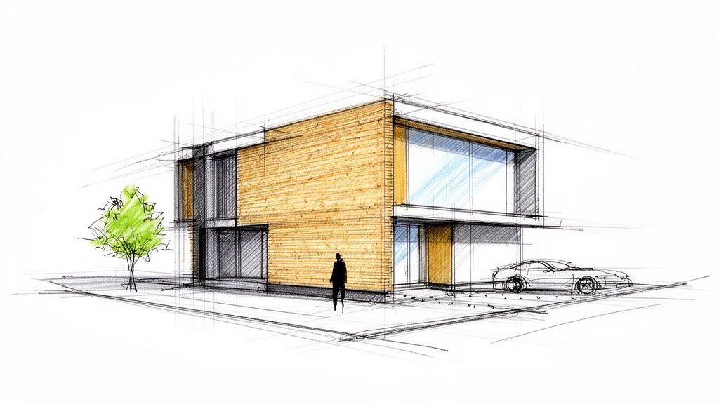
Drawing Houses With One- and Two-Point Perspective
Alright, let's get down to business. This is where theory hits the paper, and we start creating something real. We’ll kick things off with one-point perspective, which is perfect for those straight-on views—think looking right down a long street or up a driveway at the front of a house. Its defining feature is simple: every line that moves away from you converges to a single spot.
Picture a cozy little cabin. You'd start by drawing its front face, a simple square or rectangle, looking right at you. Next, you pop a single vanishing point somewhere on your horizon line. From the corners of that front face, you’ll draw light guidelines back to that vanishing point. Just like that, you've created the sides and given the cabin believable depth.
Mastering the Two-Point Perspective Workhorse
Once one-point feels natural, it's time to graduate to its more dynamic sibling: two-point perspective. Honestly, this is the one you’ll use 90% of the time for architectural sketches. It lets you draw a building from a corner, showing two sides at once for a far more engaging and informative view.
When you're tackling a house perspective drawing in two-point, you begin with just a single vertical line. This line represents the closest corner of the building. Then, place two vanishing points on your horizon line, spreading them far apart.
- Every horizontal line on the right side of that corner goes to the right vanishing point.
- Every horizontal line on the left side of that corner goes to the left vanishing point.
- All your vertical lines? They stay perfectly straight up and down.
This is the go-to method for sketching a modern two-story home, where you want to show off the interesting angles and surfaces. A huge tip I learned the hard way: push your vanishing points way out, even off the edges of your paper. If they're too close together, you get this weird, distorted fish-eye effect that just looks wrong.
This diagram breaks down the core setup for any perspective drawing, from finding your eye level to roughing in the final form.
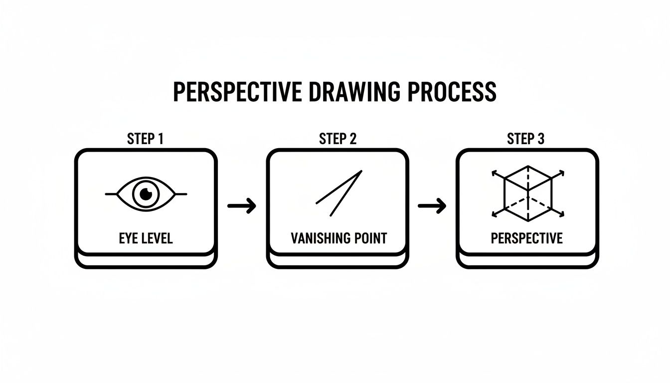
It’s a great reminder that every solid perspective sketch begins by locking in your eye level and vanishing points before you even think about drawing the building itself.
Keeping Your Proportions Realistic
Nailing the perspective grid is one thing, but making the house look believable is a whole different ballgame. That comes down to proportions. Windows and doors can't just be slapped on; they have to obey the same rules. The tops and bottoms of all the windows on a single wall must aim toward the same vanishing point.
Here’s a little trick I use constantly to get placement right: I’ll lightly sketch an 'X' from corner to corner inside a wall plane. Where the lines cross is the exact center. This makes it a breeze to place a door perfectly in the middle or space windows out evenly.
And finally, roofs. This is where so many beginners stumble. Don't just guess where the peak should go. Use that same 'X' trick to find the center of the wall, draw a vertical line straight up to your desired roof height, and then connect that new peak point back toward your vanishing points. This locks the roof onto the structure properly and keeps the geometry sound.
Creating Dramatic Views With Advanced Perspectives
Ready to sketch a house from a completely different angle? Once you've mastered the standard corner shot, it's time to explore three-point perspective. This is the secret to creating those really dramatic "worm's-eye" or "bird's-eye" views you see in architectural illustrations. It's an absolute game-changer for conveying immense scale or showing a building within its broader aerial context.
The magic happens when you add a third vanishing point. For a "worm's-eye" view, you'll place this point far below your horizon line. Suddenly, all the vertical lines that were straight in two-point perspective now recede down toward this new point. This simple trick makes a house appear to tower heroically over you.
Flip the script and place that third vanishing point high above the horizon, and you get a "bird's-eye" view. Now the house seems to shrink and recede into the landscape below. It’s a powerful way to change the entire feel of your drawing.
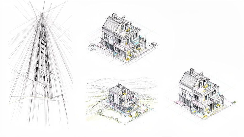
Beyond Vanishing Points With Axonometric Views
Not every powerful architectural drawing needs vanishing points. There's another incredibly useful method called the axonometric view, which was a favorite of modern architects like Le Corbusier. What sets it apart is that all parallel lines stay parallel—they never converge.
This creates a drawing that's less about photorealism and more about technical clarity. It's perfect for illustrations where you need to show how different parts of a building fit together without the distortion that perspective introduces. You can actually measure directly off an axonometric drawing, which makes it invaluable for communicating construction details or complex spatial relationships.
Axonometric drawing isn't a new concept, but its rise in the 20th century marked a huge shift in architectural communication. It moves the focus away from a single, fixed viewpoint toward a more analytical look at a design's geometry and information.
The house perspective drawing really took off in the 20th century, with axonometric and multi-point perspectives gaining serious traction after the 1970s. Le Corbusier's famous 1915 drawing of his Dom-Ino House was a landmark example of this shift, influencing what some estimate to be as much as 60% of post-WWII housing designs.
Later, architects like Michael Graves popularized exaggerated axonometrics that boosted client comprehension by as much as 50% compared to flat floor plans. Today, this evolution continues with AI tools like MoldaSpace that can generate these complex views in seconds, not hours. If you're curious, you can learn more about the evolution of architectural drawing styles and their historical impact.
These advanced techniques communicate complex ideas in ways that flat elevations or simple plans never could, giving you a powerful visual toolkit to tell a building's story.
Adding Realism With Shading and Details
Getting the perspective grid right gives you the skeleton of your drawing, but it's the details and shading that really make it breathe. This is the part of the process where a technical diagram starts to feel like a real place, something you could actually walk up to and touch. It’s often the smallest additions that have the biggest impact.
One of the most effective tricks of the trade is playing with line weight. I like to think of it like adjusting the focus on a camera. Anything closer to the viewer gets a thicker, darker line, while things way off in the background get a lighter, finer touch. This simple technique immediately creates what we call atmospheric perspective, which really helps sell the illusion of depth by pushing distant objects back and pulling the foreground forward.
Breathing Life Into Surfaces
Shading is what turns your flat shapes into solid forms with genuine substance. Before you even make a mark, decide where your light is coming from. Is it a high-noon sun? Or a low, late-afternoon glow? Once you know that, the logic follows: surfaces facing the light are brightest, and those turned away fall into shadow.
Don't forget to think about the materials you're trying to represent. Light behaves very differently on different surfaces.
- Brick Facade: I find cross-hatching works well here to give it that rough, matte texture. Adding some darker tones for the mortar lines really makes the brickwork pop.
- Glass Windows: Less is more with glass. A few subtle diagonal lines or a dark, quick reflection of a nearby tree is usually all you need to suggest transparency. Overdo it, and it just looks muddy.
- Wooden Siding: Try using long, parallel strokes that run in the same direction as the planks. This is a great way to mimic the grain and texture of real wood.
A pro tip: Cast shadows are every bit as important as the shading on the house itself. That shadow thrown by a roof overhang isn't random; it follows the same perspective lines as the house, anchoring the whole structure to the ground and seriously boosting the 3D effect.
Adding Context and Scale
A house standing alone in a white void feels sterile. To make it feel real, you need to add context. In the architectural world, we call these contextual elements "entourage," and they're essential for giving a sense of scale and telling a story.
Just adding a simple human figure near the front door instantly communicates the building's size. Throw in a few trees, a car parked in the driveway, or some basic landscaping, and the scene suddenly feels lived-in and grounded in a real environment.
These details are what separate a basic study from a compelling architectural illustration. At the end of the day, a good house perspective drawing doesn't just show what a house looks like—it helps someone imagine what it would feel like to live there. For those looking to take these sketches to the absolute peak of realism, you can learn more about photorealistic rendering software that can turn these drawings into breathtakingly lifelike images.
Turning Your Sketch Into a Photorealistic Render
A hand-drawn sketch has an energy and a life to it that digital models can sometimes miss. But let's be real—clients need to see the finished product. This is where we close the loop, taking your carefully crafted house perspective drawing and turning it into a beautiful, photorealistic render. The best part? You don't have to spend days bogged down in complex 3D modeling.
The new workflow starts with a clean, digital version of your sketch. A quick scan or a good photo will do. From there, a tool like MoldaSpace can bring that sketch to life in minutes, not days. You just upload your drawing and use simple, everyday language to tell the AI what you want to see.
From Lines to Lifelike Visuals
Imagine you've just finished a great two-point perspective sketch of a modern home. The old way meant rebuilding the whole thing from scratch in SketchUp or Revit. Now, you can just type what's in your head and see it happen. This lets you cycle through ideas in seconds.
Here’s how that might look in practice:
- Swapping Materials: You could try "make the siding dark cedar with black metal trim," and then a moment later, "change the brick to a light, sandy color." No re-mapping textures, just a new idea.
- Controlling the Mood: Want to see how it feels on a different day? Type "render in a moody, overcast style" or "show the house at golden hour with warm lighting."
- Adding Landscaping: Ground the design in a realistic setting with prompts like "place a large oak tree on the right side" or "add a minimalist garden with native grasses."
This isn't about just getting one render; it's about generating a whole suite of high-quality options faster than I ever thought possible. It's an incredible way to explore and show clients a variety of polished visuals. The same concepts work wonders for interiors, and you can learn more about using AI for interior design in some of our other guides.
Workflow Comparison: Traditional vs. AI-Powered Rendering
To really understand the shift, let’s look at what it takes to get from a finished sketch to a client-ready presentation using both old-school and new-school methods. The differences in time, cost, and skill are pretty stark.
| Step | Traditional Rendering (V-Ray, Lumion) | AI-Powered Rendering (MoldaSpace) |
|---|---|---|
| 3D Modeling | 10–20 hours; requires expert-level skill in software like Revit or 3ds Max. | Not required. The sketch is the direct input. |
| Material/Texture Application | 4–8 hours; involves sourcing, mapping, and adjusting complex texture maps. | 5–15 minutes; described using simple text prompts. |
| Lighting & Environment Setup | 3–6 hours; meticulous placement of light sources and HDRI environments. | 2–10 minutes; controlled with natural language like "sunny day" or "dusk." |
| Rendering Time | 1–5 hours per image; heavily dependent on hardware and scene complexity. | Under 1 minute per image; cloud-based, so no local hardware strain. |
| Revisions & Iterations | Hours to days for each significant change, often requiring re-rendering. | Minutes; new prompts generate completely new options on the fly. |
The takeaway here is pretty clear: while traditional rendering gives you granular control, it comes at a significant cost in time and expertise. For rapid ideation and presentation, the AI-powered approach collapses the timeline dramatically, opening up new possibilities for designers.
A Modern Shift in Architectural Presentation
The push for impressive visuals is nothing new. Back in the 19th century, the boom in elaborate presentation drawings marked a huge shift in the profession. It separated the quick idea sketch from the polished perspective and the technical construction documents. You can actually read more about the history of architectural drawing practices to see how deep these roots go.
Today, small studios and solo architects are under the same pressure. Recent industry polls show that for 85% of firms, top-notch visualization is a deciding factor in winning projects. This is where tools like MoldaSpace come in. They level the playing field, letting designers iterate up to 10x faster and produce work that competes with what the big firms are putting out.
This isn't about letting a machine take over your job. It's about having a powerful collaborator. Think of it as an assistant that can instantly show you ten different material combinations, letting you refine your vision with incredible speed and walk into a client meeting with total confidence.
Ultimately, this kind of workflow frees you up to focus on what you do best—the design itself. By taking on the heavy lifting of visualization, it lets you explore more creative ideas and deliver presentations that help clients truly see the potential in your work.
Got Questions About Drawing Houses in Perspective?
Even when you feel like you've got the rules down, some tricky situations always seem to pop up when you're in the middle of a drawing. These common sticking points can be a real headache, but the solutions are usually simpler than you think. Let's break down some of the most frequent questions I hear from artists and designers.
Getting proportions right, especially for things like windows and doors, is a classic challenge. Here's a quick trick I use all the time: use diagonals. Lightly pencil in an 'X' from corner to corner across a wall plane. Where the lines cross is the exact center, which makes placing a central door or spacing out windows a breeze.
Another thing that trips people up is drawing curves. How do you get that perfect arched window to look right in perspective? The key is to start with a flat shape. First, draw a square in perspective that the arch would fit snugly inside. Then, you can use diagonals to find its center and sketch your curve to fit.
What's the Biggest Mistake Beginners Make?
By far, the most common and jarring mistake is squishing the vanishing points too close together. When your points are too near your subject, you end up with an extreme, distorted "fish-eye" look. It feels completely unnatural and can wreck an otherwise great drawing. It's a really easy trap to fall into, especially when you're trying to keep everything on a single sheet of paper.
The fix is simple: give your vanishing points some breathing room. Don't be afraid to place them far apart on your horizon line, even if they run right off the edges of your paper. I often tape extra sheets to the sides of my drawing board to make it work. A wider distance between your vanishing points will always give you a more subtle, realistic, and pleasing perspective.
The goal is to mimic how our eyes actually see the world. We have a wide field of vision, so a drawing with widely spaced vanishing points just feels more natural. It avoids compressing a broad view into a narrow, distorted frame.
How Do I Draw Circles and Arches in Perspective?
Drawing curved forms like circular windows or arched doorways can feel intimidating, but there's a straightforward method that works every time. The secret is to build the curve inside a simple box that's already in perspective.
Here’s how I break it down:
- Draw the Box: Start by drawing a square in perspective on the wall where your circle or arch will go. Make sure this square's lines recede correctly toward your vanishing points.
- Find the Center: Lightly draw two diagonal lines from corner to corner inside your perspective square. The point where they cross is the true center.
- Sketch the Ellipse: Now, you can sketch an ellipse inside that square so that it gently touches the midpoint of each of the four sides. This ellipse is what a circle looks like when viewed in perspective.
For an archway, you just use the top half of this ellipse. This technique ensures your curves look like they belong on the surface and aren't just stuck on as an afterthought. Getting comfortable with this process is a huge step toward creating convincing house drawings. And for those working digitally, many of the best 3D rendering software options for interior design have tools that can simplify this even further.
Is One-Point Perspective Actually Useful for Exteriors?
Absolutely. While two-point perspective is the workhorse for most corner views of a house, one-point perspective is incredibly powerful for certain kinds of exterior shots. It creates a powerful sense of focus and depth that pulls the viewer's eye right into the scene.
Picture a view looking straight down a long, tree-lined driveway with the house sitting perfectly at the end. Or think of a symmetrical, front-on view of a classic home with a central path leading right to the front door. For scenarios like these, one-point perspective is the perfect choice to create a dramatic and focused composition.
Ready to turn your perspective sketches into stunning, photorealistic visuals in seconds? MoldaSpace uses AI to transform your drawings into client-ready renders without the need for complex software. Try it for free today!